Sizing UIs in VR with Distance-Independent Millimeters

I recently watched a great talk by the Google Daydream team about designing screen interfaces for VR. Adam Glazier and Chris McKenzie dove into some of the challenges and pitfalls around creating two-dimensional screens within the VR space. Their team needed a way to design screens that could be easily read at any distance. To help solve this, they came up with "Distance-Independent Millimeters" or DMMs. The following are my summarized notes from their presentation at Google I/O 2017.
Challenges with designing for screens in VR
It's difficult to make sure that text in UIs that are easily readable and that buttons and other interactive elements are easily clickable. Even though we have the capability to think of fantastic new methods of display in a 3D world, if we have a dense amount of content we found ourselves essentially designing screens in VR.
This shouldn't be surprising at all. Screens are efficient ways of communicating information. Even in the real world, we're constantly reading text off of a 2D plane. It makes sense for us to also communicate information this way in VR as well.
The problem that we have with VR is that the tools and techniques that we use to design for screens in real life don't necessarily apply in VR. What the Google design team did is distill the principles from real life screens and then use that as a tool to create virtual screens.
Screens and their intended viewing distance
What all screens have in common is an intended viewing distance. Smaller screens like watches, phones and laptops are intended to be viewed much closer than a billboard.
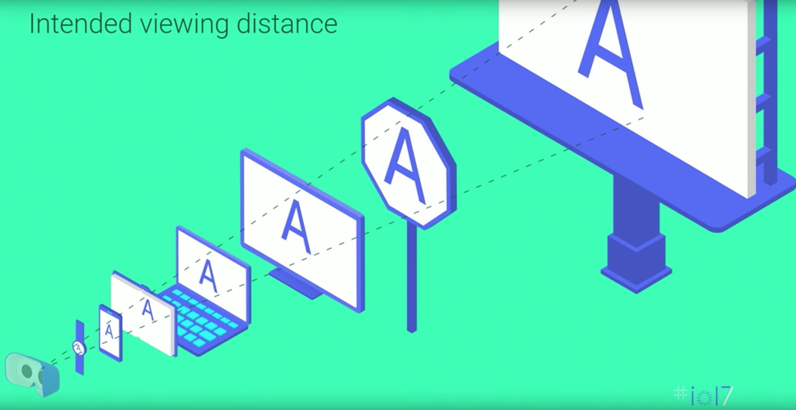
This intended viewing distance both informs the size of the screen, and the density of the containing information. This creates an incredible challenge for designers because we're now responsible for not just 1 type of screen design like mobile, but multiple possible screens and distances within a VR world.
Angular Units
One way to create content that's consistent across all different screen types is to use angular units and make sure that text has the same angular size.

The A on the billboard is much larger than the A on the smartphone in terms of absolute font size. But from the user's point of view, they're going to look pretty much the same size.
Angular units are powerful because if we can design all of our layouts using it, text will be just as readable no matter how far away the screen is.
Introducing the DMM: Distance-Independent Millimeter
A DMM is 1 millimeter viewed at 1 meter away. It's an angular unit that follows a MM into the distance.
To use the DMM, measure your UI elements in terms of DMMs. You can then translate that into world space by multiplying the DMMs by distance. DMMs allow us to design our UIs once, and then scale later.
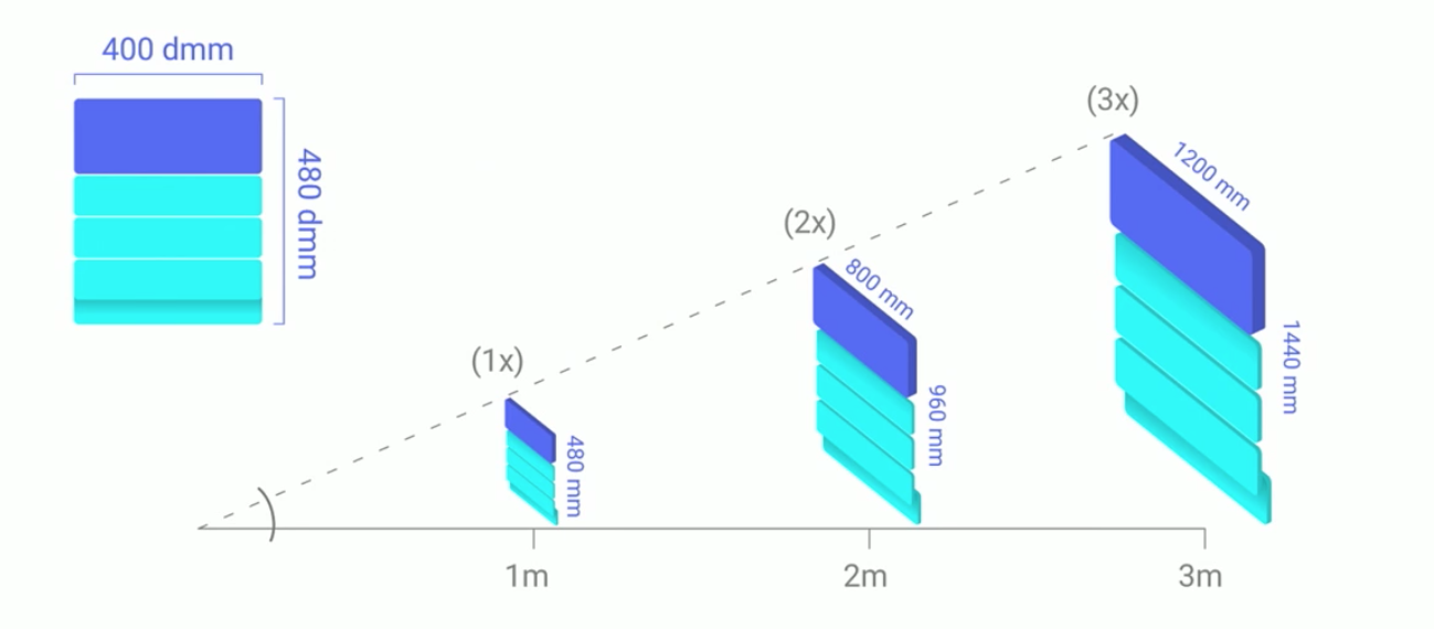
In this example, all three screens have a different intended viewing distance. From these vantage points, all three will read the same and move the same. A nice benefit to this is that any animations on that element will also be scaled appropriately as well.
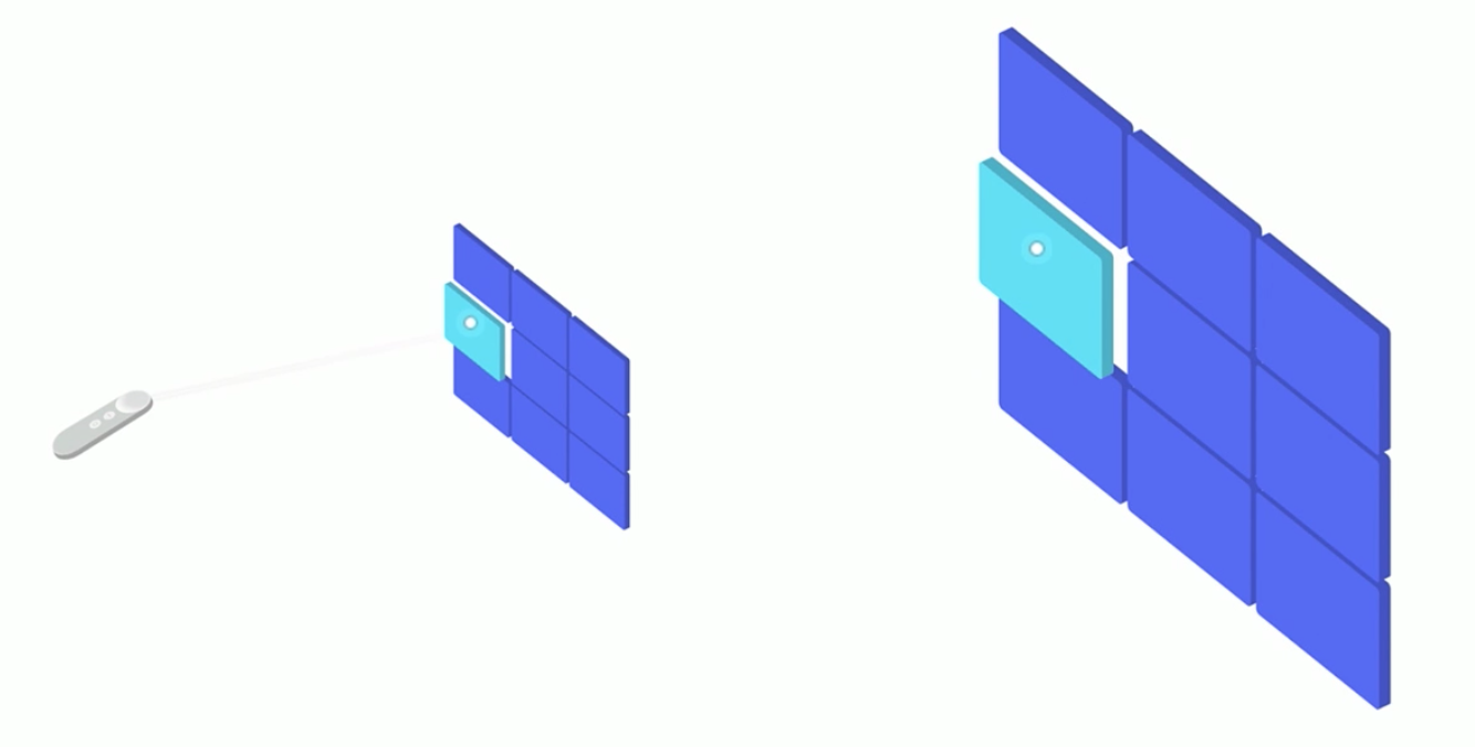
This model works well for ray-based input. Because we're scaling our UIs with distance, all of our hit areas are also scaling to be able to catch that ever-growing margin of error. So we can measure all of our hit areas in DMMs as well.
So far our examples haven't taken to account the user being able to move around. If you were to get closer to one of these far-away screens, the text would be massive. Any animations done would be very fast and textures would likely be blurry. This is OK! The same thing happens in the real world if you try to view your television from only a couple of inches away.
DMMs are not bound by width and height. Everything that you're measuring in DMMs in X and Y can also have Z. Virtual screens can have thickness and use depth to indicate certain interactions.
Guidelines and Workflow
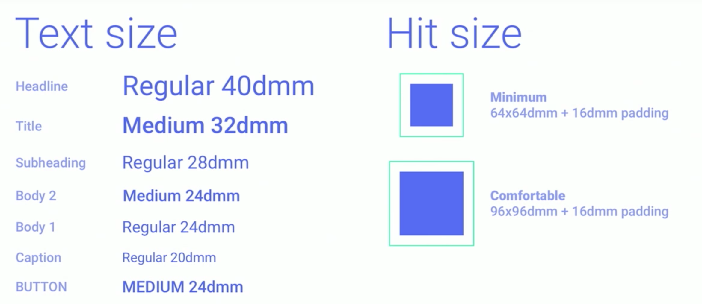
The Google design team has put together guidelines for font sizes that are readable for most people. For body content, size your text 24 DMMs. For ray-based hit sizes, use at least 64x64 DMMs with 16 DMM padding.
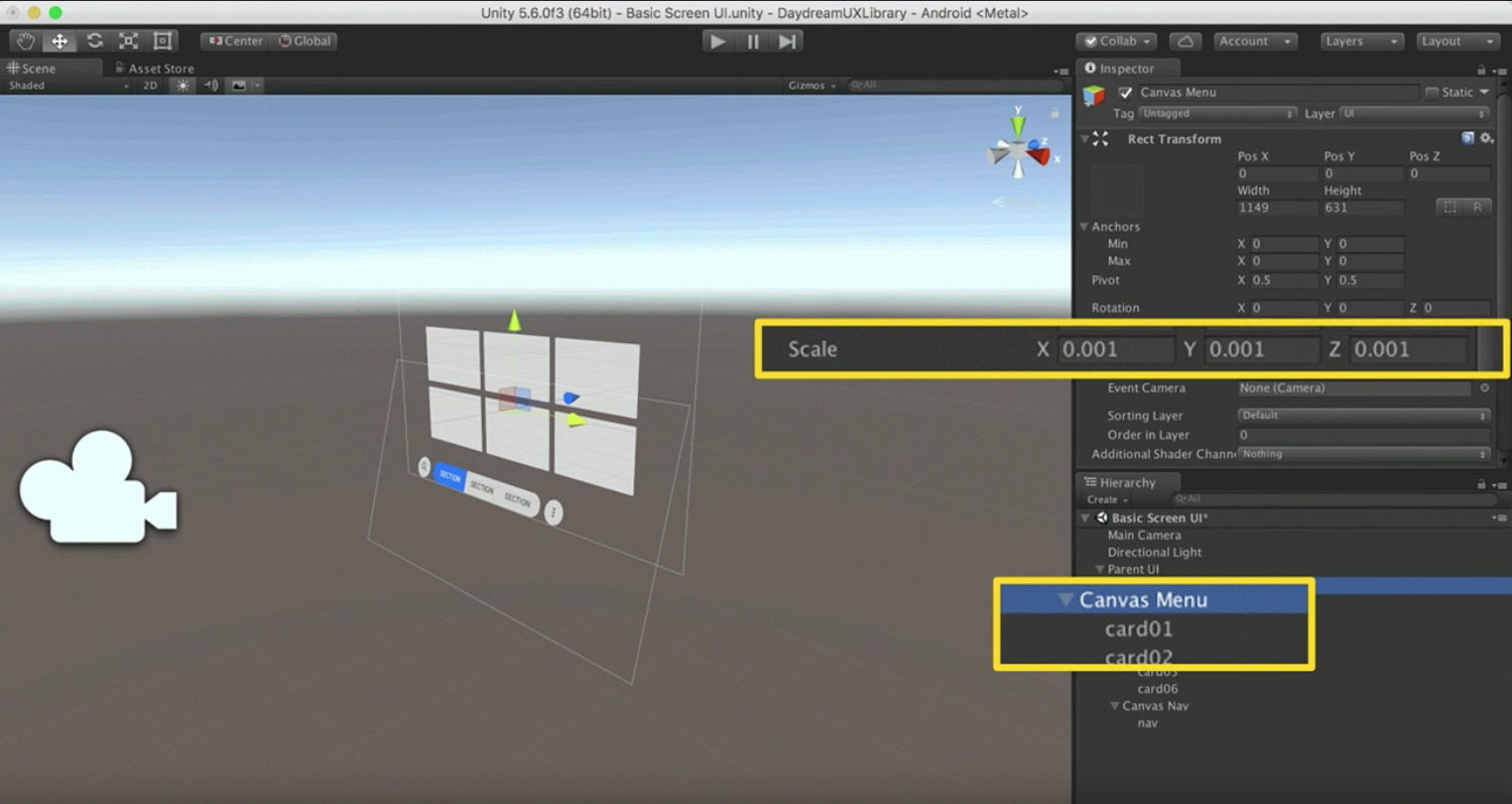
In Unity, the canvas dimensions are in meters, so this has to be scaled down by 1000%. This allows us to use DMMs in the canvas element. If a button is 100 DMMs wide, we would just enter that amount in here. Now we can scale the size of the element depending on its intended viewing distance. If the element is moved backwards by 3, we can then scale the element by 3 as well.
Resources
Designing Screen Interfaces for VR - Google I/O '17
Daydream Components Sticker Sheet - Google
Presenters: Adam Glazier and Chris McKenzie